The brief
We were asked to reduce the avg time a user needs to place an order without affecting the AOV. We also had to increase discoverability of new offerings so that our customers know every time we add new items.
The Problem
- The lines at the Kiosk were getting longer and had long wait times
- New offerings were going unnoticed increasing food wastage
Team
2 backend dev, 3 frontend dev, 1 UX researcher, 2 QAs, 1 partnership manager, 1 product manager, 1 product designer (me)
Constraints
- The product offered a lot of configurations and almost every client had a different version of the Kiosk so we had to keep all the configs in mind while coming up with a solution
- Setting up and managing the kiosk is not very easy so we had to make sure that we do not increase the setup time too much
- The kiosk hardware isn’t very powerful, so heavy animations and horizontal scroll interactions can lag.

It had an ongoing discussing for a very long time that we need some way to gather data from real users. After a very strong push from me and team we finally set up Mixpanel on all major sites to gather data and validate our work.
objective
- To gather data and see where the problems lie
- See how much time users are actually spending on the kiosk and on which page
- Check whether our designs are actually solving the issue or not
To get a better understanding of how a corporate cafeteria operates I spent a lunch break working at the cafeteria behind the counter.

objective
- Saw how the customers interact with the digital products in the cafeteria (kiosk, POS, menu display and TDS)
- Got a better understanding of the entire ordering journey
- Check whether our products are actually helping users
We gathered these insights from user interviews in India which were then validated by Mixpanel data and also by a few user interviews from the UK
- Most customers choose between the same 2 items everyday
- Very few customers explored the menu to look for new items
- “Restaurants” don't poperly convey what type of food they serve
The regular

Always sticks to the same trusted items, minimal variation
The explorer

Leans on favorites but is open to trying something new when nudged
The Deal hunter

Motivated by offers, discounts, and value bundles
- Reduce time taken to checkout
- Reduce time taken to decide what to eat i.e reach the cart summary page
- Increase number of orders for new items
Initially one of the goal was to reduce the time a user spends on the kiosk but after discussions with the team we decided to change the goal to reduce the time taken to add the first item to cart because we wanted the user to spend time exploring recommended items, todays specials, etc and order more items.
We asked the UK team to make videos of them using other popular kiosk's in the UK so that we get an idea of how the other popular brands (McDonalds, KFC, Starbucks, etc) are designing their kiosk. There a few changes we thought we could make to our kiosk to achieve our goals.

Taking inspiration
- If we identify the user in the beginning of the journey we can personalise their experience
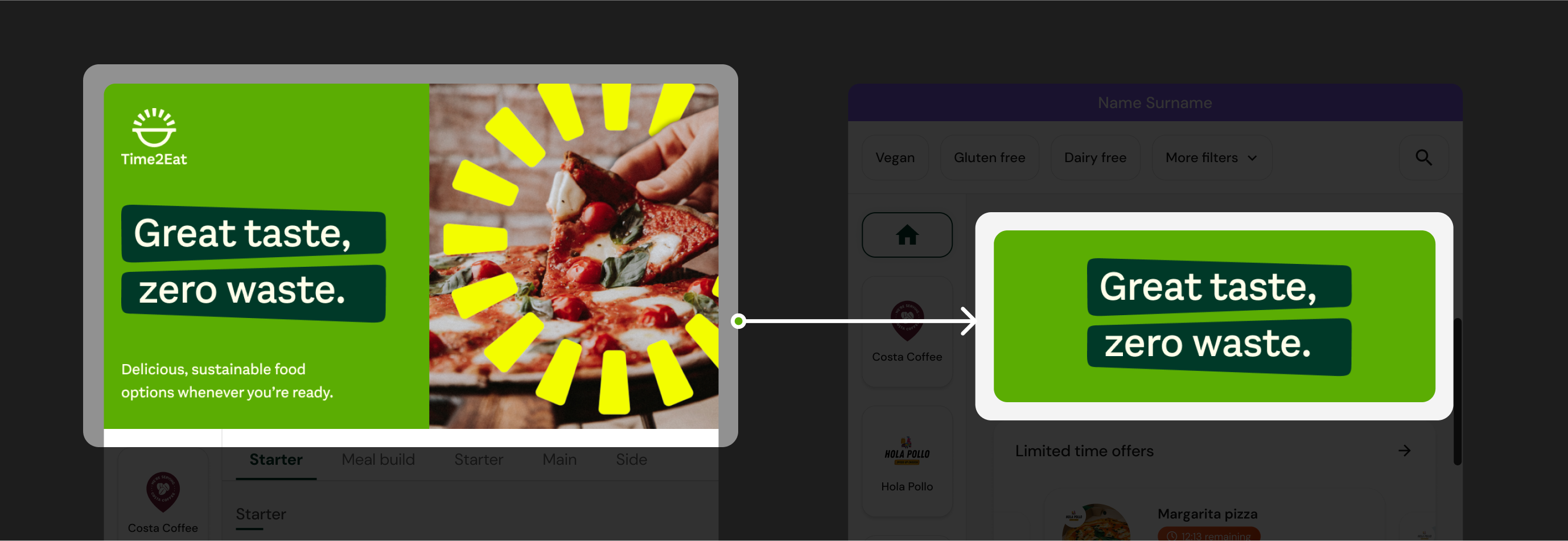
- Banners dont need to takeup one third of the screen
- Show all menu categories upfront so that the user know whatall we serve
Options we thought of
- Smarter upselling recommendations
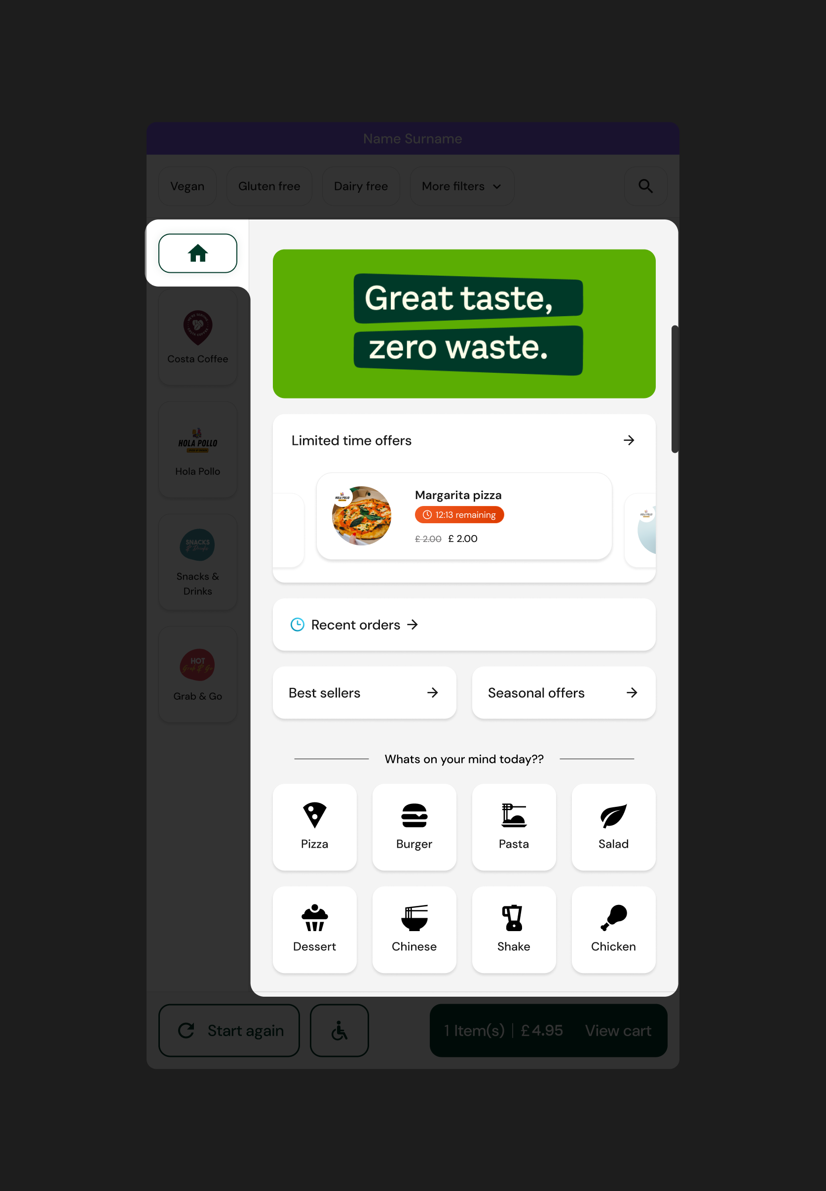
- Build a homepage for the kiosk
- Option to search and filter menu
- A loyalty program
- Face recognition and identification
- Search enhancements and voice search
- Healthy foods and nutritional information
Prioritising our options
To make sure we get the most value for our efforts we plot all our options on a impact, effort matrix. While measuring effort we kept in mind dev effort, setup effort and upkeep effort.

We choose a couple options and decided to make a design prototype which would then be shown to actual users in the UK. We also made a few more changes to the flow which we thought with help us achieve our goal
User identification update
User identification that previously used to happen only on the cart summary page can now happen at the very beginning of the journey. We did this so that we could personalize the home page for users.

added Search and Filters

Banner update
The banner was taking up too much space so we decided to recude the size and make it a part of the homepage

CTA copy update
While taking to a user they mentioned that they thought the "checkout" button on the menu screen would take them directly to the payments page which was not the case so we changed the copy to "view cart"

Added a homepage

Another idea we discusses but had to drop
We thought of combining the payment method selection page and the cart summary page but had to drop it because there were a lot of configurations on the cart summary page that a client could opt in for and this page was already taking time to load so we did not want to add to the load
First iteration prototype
The first iteration prototype was tested with actual users in the UK, this helped us gather valuable insights that helped us challenge current methods.
insights
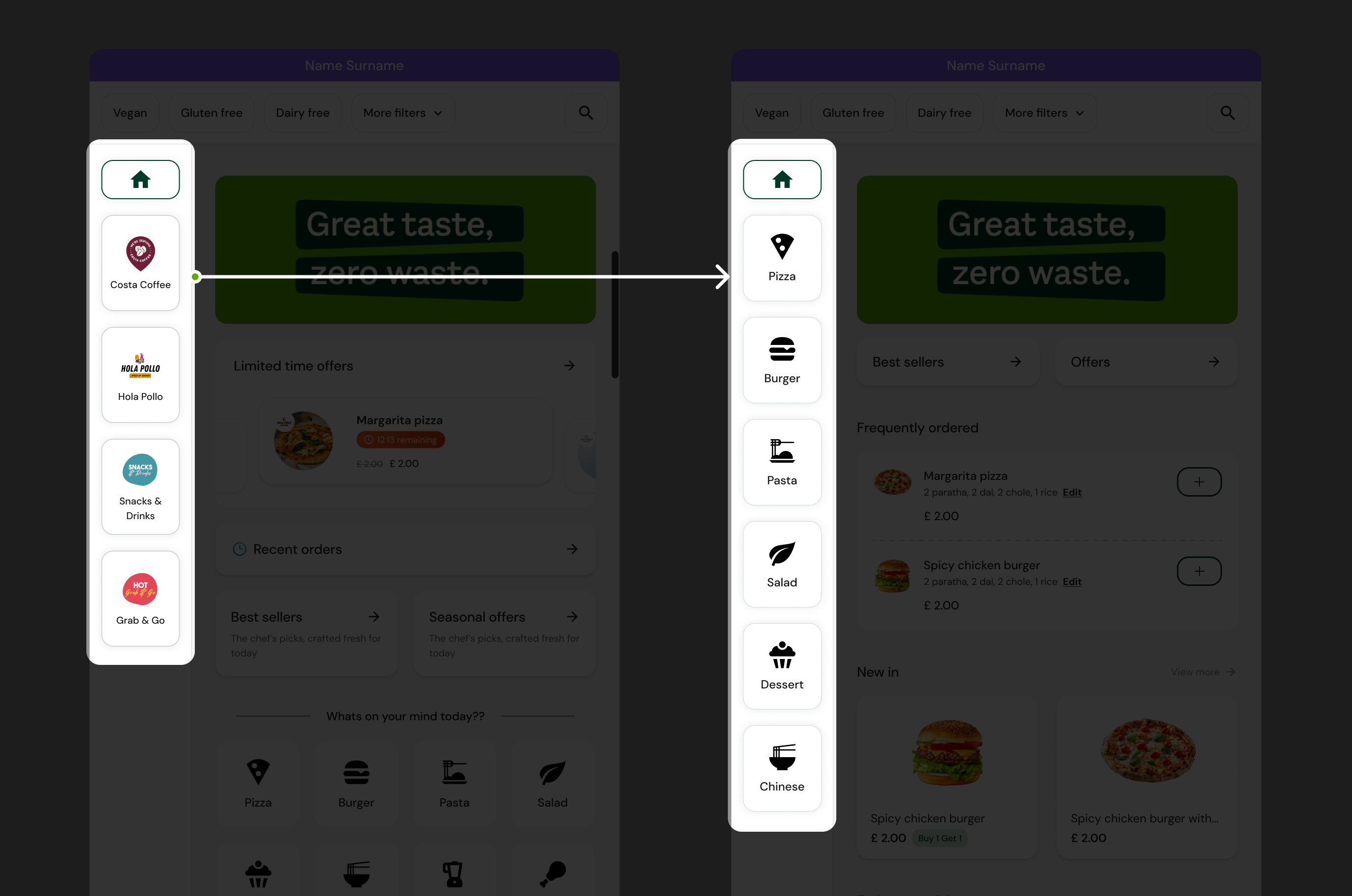
- UK users don't really care what “restaurant” their order comes from because the collection point is the same
- We can show recent orders food cards upfront instead of showing a button for it
what if
What if we can get rid of the restaurants concept?
Business constraints
Stakeholders were hesitant to get rid of the “restaurants” concepts all together because:
- There were standard procedures set around having restaurants
- Restaurant wise sales data was important to the business
what if 2.0
What if we can get rid of the restaurants concept from the frontend while still keeping them in the backend?
After making changes based on the insights gathered from testing the first iteration we reached our final solution which was pretty well received by our test audience
navigation update
Once we realised that the users dont care about restaurants and we were sure that we could make this change we went ahead with it. The updated navigation lets the users know what all food types we serve which also helps in increasing discoveranility

User identification update
Instead of having a separate page for user identification, the users can now identify themself fro the splash screen itself.

recent orders update
Showing food cards upfront on the home page along with saving past customisations would reduce the steps the user has to take to add the item to cart.

time to decide what to eat
-18 secs
Increase in orders of new offerings
Calculating...
- Challenge current methods and maybe update them if needed in favour of a better experience for customers and to achieve business goals
- Keep in mind what all configurations are possible for customisable products


